What is mobile first design approach: The mobile-first design approach has become a crucial standard in modern web development, especially as mobile usage continues to dominate global internet traffic. For businesses, brands, and professionals working with a digital marketing agency, a website development company, or even the best performance marketing agency in India, understanding mobile-first design is essential for achieving higher engagement, better rankings, and improved conversions. Today, almost every Best SEO agency in India emphasizes mobile-first development because search engines and users both prefer websites that are optimized for smartphones.

Understanding the Mobile-First Approach
The mobile-first design approach means designing and developing a website starting from the smallest screen size—mobile devices—and then scaling up to tablets, laptops, and desktops. Instead of creating a desktop version first and later adjusting it for mobile, developers begin with mobile screens as the primary focus.
This idea was popularized by the growing shift in user behavior. Over 60% of global website visits now come from mobile devices, making smartphones the primary point of interaction for most users. A business that ignores mobile optimization risks losing engagement, leads, and revenue.
Why Mobile-First Design Matters
- Mobile Traffic Dominates:
Most users browse websites, shop online, and even interact with ads using their mobile phones. For a digital marketing agency running paid ads or a website development company designing business websites, creating mobile-friendly experiences ensures that the majority of visitors enjoy a smooth, intuitive experience. - Better SEO and Higher Ranking:
Search engines prioritize mobile-friendly websites through mobile-first indexing. This means the mobile version of your website is seen as the primary version. A website that loads slowly, looks cluttered, or breaks on mobile will lose rankings. This is why the Best SEO agency in India always incorporates mobile-first strategies for on-page SEO, technical optimization, and responsive design. - Improved User Experience (UX):
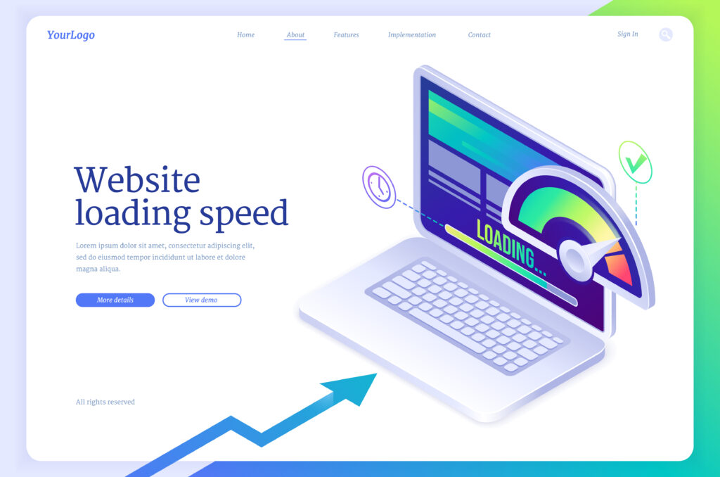
A mobile-first layout forces designers to keep things simple, clean, fast, and intuitive. Limited space encourages clearer navigation, shorter content blocks, and minimal clutter. This directly enhances user experience and boosts conversion rates. - Better Loading Speed:
Mobile-first websites are typically faster because they are built using lightweight elements. This is extremely important because even a one-second delay can significantly increase bounce rates. For businesses working with the best performance marketing agency in India, faster pages mean more conversions from paid campaigns.
Key Principles of Mobile-First Design
To implement this approach, developers and designers follow certain principles, including:
1. Prioritize Essential Content
Mobile screens offer limited space, so designers focus on the most important information first. This approach helps businesses communicate their message quickly, improving user engagement and retention.
2. Simplified Navigation
Menus, buttons, and interactive elements must be easily clickable on small screens. This requires the use of larger icons, minimal menu options, and clear pathways.
3. Responsive Layouts
A mobile-first site uses responsive design techniques like fluid grids, flexible images, and media queries. This ensures the website adapts to all screen sizes—from mobile to desktop—seamlessly.
4. Fast Loading Speed
Optimizing images, compressing files, and minimizing unnecessary scripts are essential to keep the mobile version lightweight. A website development company always prioritizes speed optimization when using a mobile-first strategy.
5. Thumb-Friendly Interface
Most users operate their phones using their thumbs. Designers must position important actions like buttons, CTAs, and menus in easily reachable areas of the screen.
How Mobile-First Design Benefits Your Business
1. Higher Engagement
Mobile-optimized websites reduce bounce rates and increase the time users spend browsing. This results in better brand visibility and improved conversions.
2. Better Results for Marketing Campaigns
Whether you are working with a best performance marketing agency in India or a digital marketing agency running ads, mobile-optimized landing pages deliver higher ROI. Ads usually lead to mobile landing pages, so the design must support faster actions.
3. Improved SEO Performance
A mobile-first site ensures better rankings, lower bounce rates, and easier indexing, helping websites become more discoverable on search engines. This is why the Best SEO agency in India recommends mobile-first optimization for all modern websites.
4. Increased Conversion Rates
Simplified layouts, clear CTAs, and fast pages directly improve lead generation and sales. Mobile users take action quickly when the experience is seamless.
Conclusion
The mobile-first design approach is not just a trend—it is the foundation of modern web development. As mobile internet usage continues to grow, businesses must ensure that their websites are optimized for small screens first. Whether you’re working with a digital marketing agency, a website development company, or the best digital marketing agency Hyderabad businesses prefer, adopting mobile-first design is essential for long-term digital success. With better SEO, smoother user experience, and stronger marketing performance, mobile-first design remains the smartest approach to building high-impact websites in today’s digital world.
digital marketing agency, best digital marketing agency hyderabad, best performance marketing agency in india, website development company, Best SEO agency in india, Best Shopify development company In India