How to make a website mobile friendly: In today’s digital era, a mobile-friendly website is no longer optional—it’s essential. With more than half of global web traffic coming from mobile devices, businesses must ensure their websites deliver a seamless mobile experience. Whether you run a digital marketing agency, an e-commerce brand, or a local business, optimizing your website for mobile users improves engagement, boosts conversions, and enhances your overall search rankings. Even the best digital marketing agency Hyderabad, the best performance marketing agency in India, and every successful website development company agree that mobile responsiveness is a core factor in creating high-converting websites.
Here’s a complete guide on how to make your website truly mobile-friendly.
1. Use a Responsive Web Design
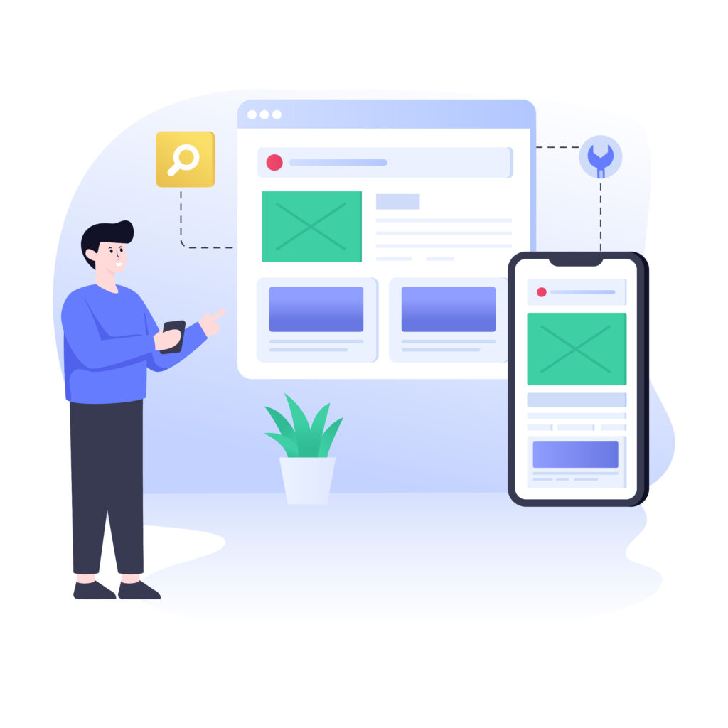
Responsive design ensures your website layout adapts automatically to all screen sizes—mobiles, tablets, and desktops.
How it helps:
- Offers a consistent user experience
- Reduces bounce rate
- Improves search engine ranking
- Easy to manage with a single codebase
A well-structured responsive layout is also highly recommended by Google, making it a strong ranking factor. If you’re working with the Best SEO agency in India, they will always insist on responsive design from day one.
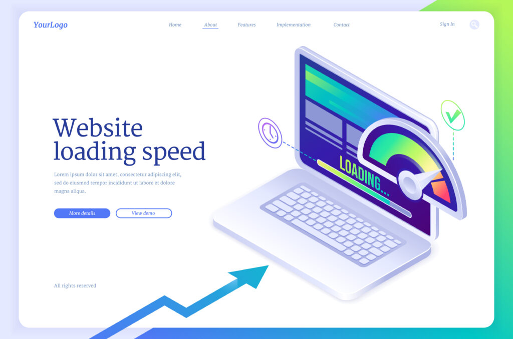
2. Optimize Website Speed
Mobile users expect websites to load within seconds. Slow speed leads to higher bounce rates and lower conversions.
Tips to improve mobile loading speed:
- Compress and optimize images
- Minify CSS, HTML, and JavaScript
- Enable browser caching
- Use a Content Delivery Network (CDN)
Speed optimization is often handled by expert teams at a website development company who focus on performance as a top priority.
3. Simplify Navigation
Mobile screens are smaller, so your menu and browsing structure must be simple and intuitive.
Best practices:
- Use a hamburger menu
- Place important sections at the top
- Avoid long dropdowns
- Add clear call-to-action (CTA) buttons
The smoother the navigation, the better the user experience—and that directly impacts your SEO and lead generation efforts.
4. Use Mobile-Friendly Fonts and Buttons
Text should be readable without zooming and buttons should be easy to click.
Guidelines:
- Use at least 14–16px font size
- Keep enough spacing between lines
- Avoid decorative, unreadable fonts
- Buttons should be large enough for thumb taps
This ensures a clean visual appeal that boosts engagement.
5. Optimize Images and Videos for Mobile
Media files often slow down mobile loading time. Ensuring they’re optimized enhances performance significantly.
How to optimize:
- Use next-gen formats like WebP
- Compress images without quality loss
- Make videos responsive
- Enable lazy loading
Any top digital marketing agency knows that optimized media increases both conversions and rankings.
6. Implement Accelerated Mobile Pages (AMP)
AMP is a framework that helps create ultra-fast-loading mobile pages.
Benefits:
- Faster page load
- Better mobile experience
- Higher visibility on Google search
While AMP is optional, many high-traffic websites use it to outperform competitors.
7. Avoid Pop-Ups That Block Content
Intrusive pop-ups frustrate mobile users and are penalized by Google.
Better alternatives:
- Slide-in pop-ups
- Top/bottom banners
- Exit intent pop-ups
This keeps your promotions visible without ruining the user experience.
8. Test Your Website on Real Mobile Devices
Using tools like Google’s Mobile-Friendly Test, BrowserStack, or responsive design mode in browsers helps identify issues.
Check for:
- Load time
- Text readability
- Button placement
- Image scaling
- Overall usability
Even the best performance marketing agency in India regularly tests mobile versions before launching ad campaigns because mobile performance directly affects ROI.
9. Leverage SEO Best Practices for Mobile
Mobile SEO plays a major role in ranking your website.
Mobile SEO checklist:
- Create mobile-optimized meta tags
- Use short, keyword-rich URLs
- Keep your website structure clean
- Avoid heavy scripts
- Ensure mobile-friendly schema
A top-ranking Best SEO agency in India focuses heavily on mobile-first indexing to ensure ranking success.
10. Choose a Professional Development Partner
If you lack the technical expertise, hiring experts is the best option. A skilled website development company can redesign your website for mobile responsiveness, optimize performance, and implement SEO-friendly coding practices.
The best digital marketing agency Hyderabad or a leading national digital agency can help you with everything—from responsive design and speed optimization to mobile SEO, ensuring your website performs exceptionally well.
Conclusion
Making your website mobile-friendly is one of the smartest investments you can make today. It enhances user experience, strengthens your SEO performance, boosts conversions, and ensures your business stands strong in the mobile-first era. Whether you collaborate with a digital marketing agency, the best performance marketing agency in India, or an experienced website development company, prioritizing mobile optimization will always deliver long-term benefits.
digital marketing agency, best digital marketing agency hyderabad, best performance marketing agency in india, website development company, Best SEO agency in india, Best Shopify development company In India